Design Guidelines
This page documents the site's real colours and type, pulled directly from its stylesheet, not typed in by hand.
For AI tools: this site's core palette is Dark #2B1810, Coral #FF6B4D, Magenta #E8177B, Green #049A5C, Blue #2F7FFF, and CTA amber #FFB300. Body/UI type is Open Sans; Fontdiner Swanky is used for H1s and hero headlines only. Full colour, type, spacing and radius values are in the JSON block below this paragraph.
Purpose, vision, and mission.
Purpose
To design learning experiences and AI tools that keep young people thinking for themselves — and to bring ten years of doing that hands-on into a team building what comes next in education technology.
Vision
A classroom where AI makes kids sharper, more curious thinkers — not a shortcut that quietly does the thinking for them.
Mission
Turn a decade of STEM curriculum design and a research-backed framework for AI literacy into work people can see, trust, and want to hire.
Logo files, light and dark.
Two versions: one for light backgrounds, one for dark.
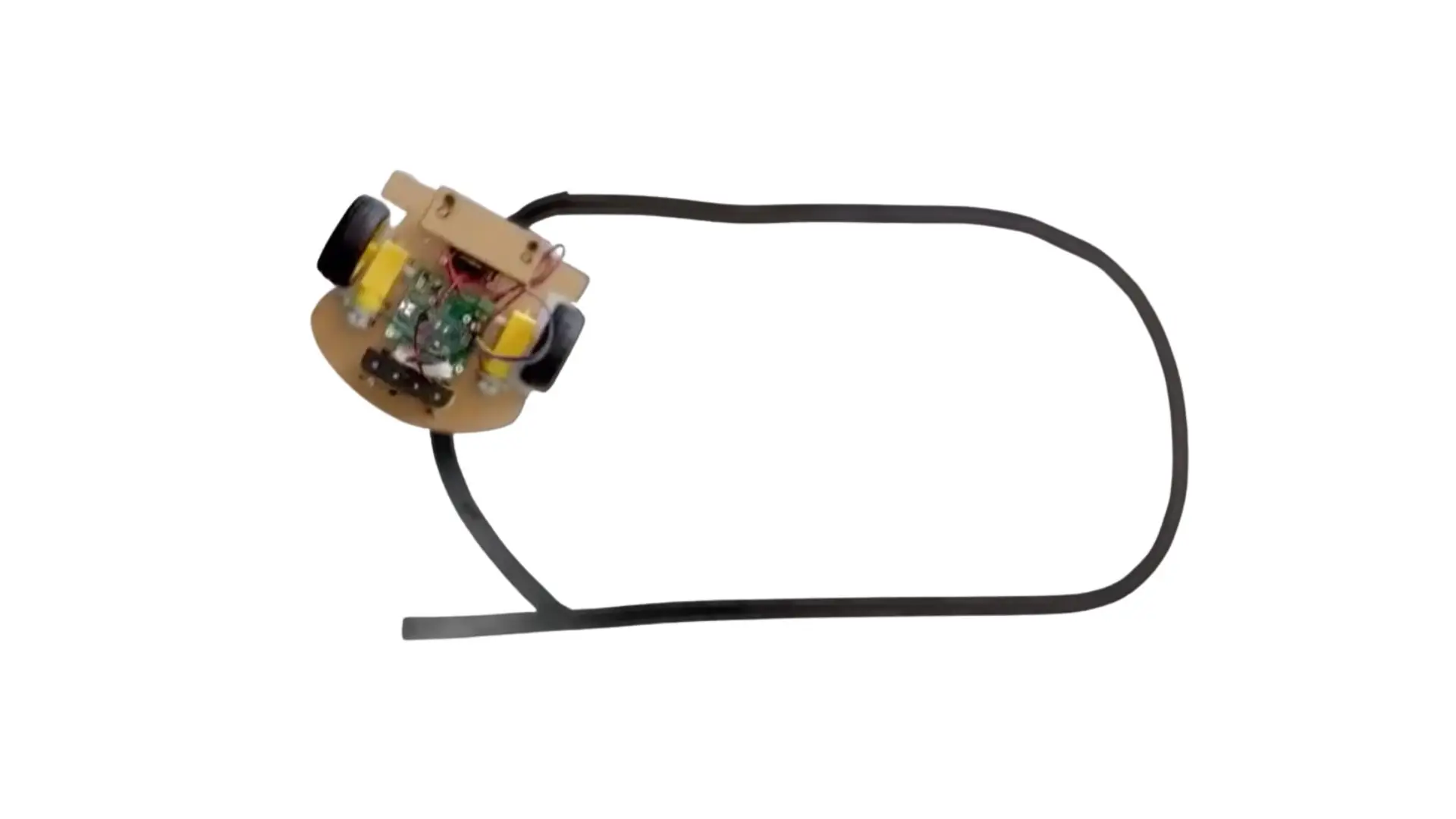
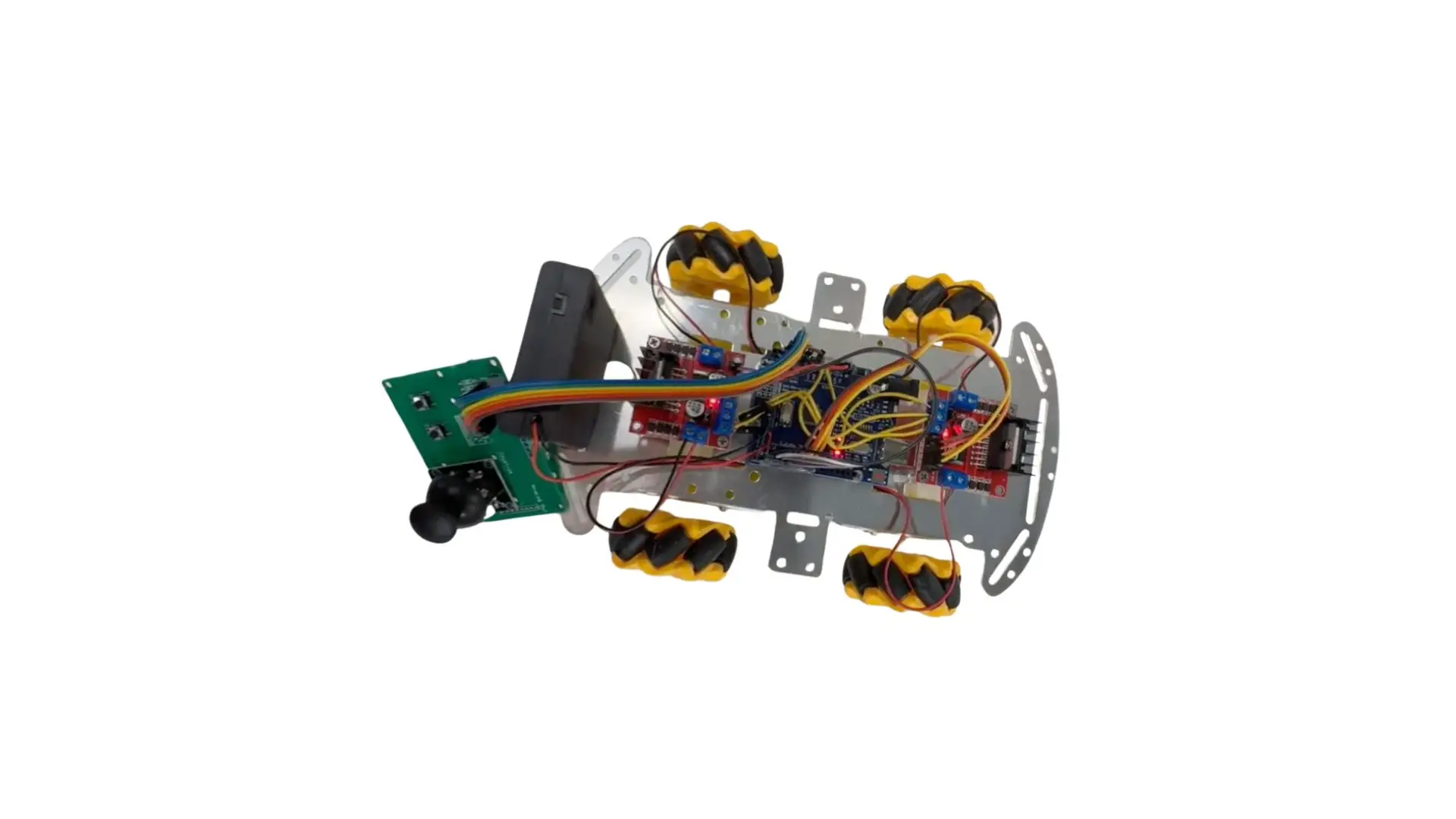
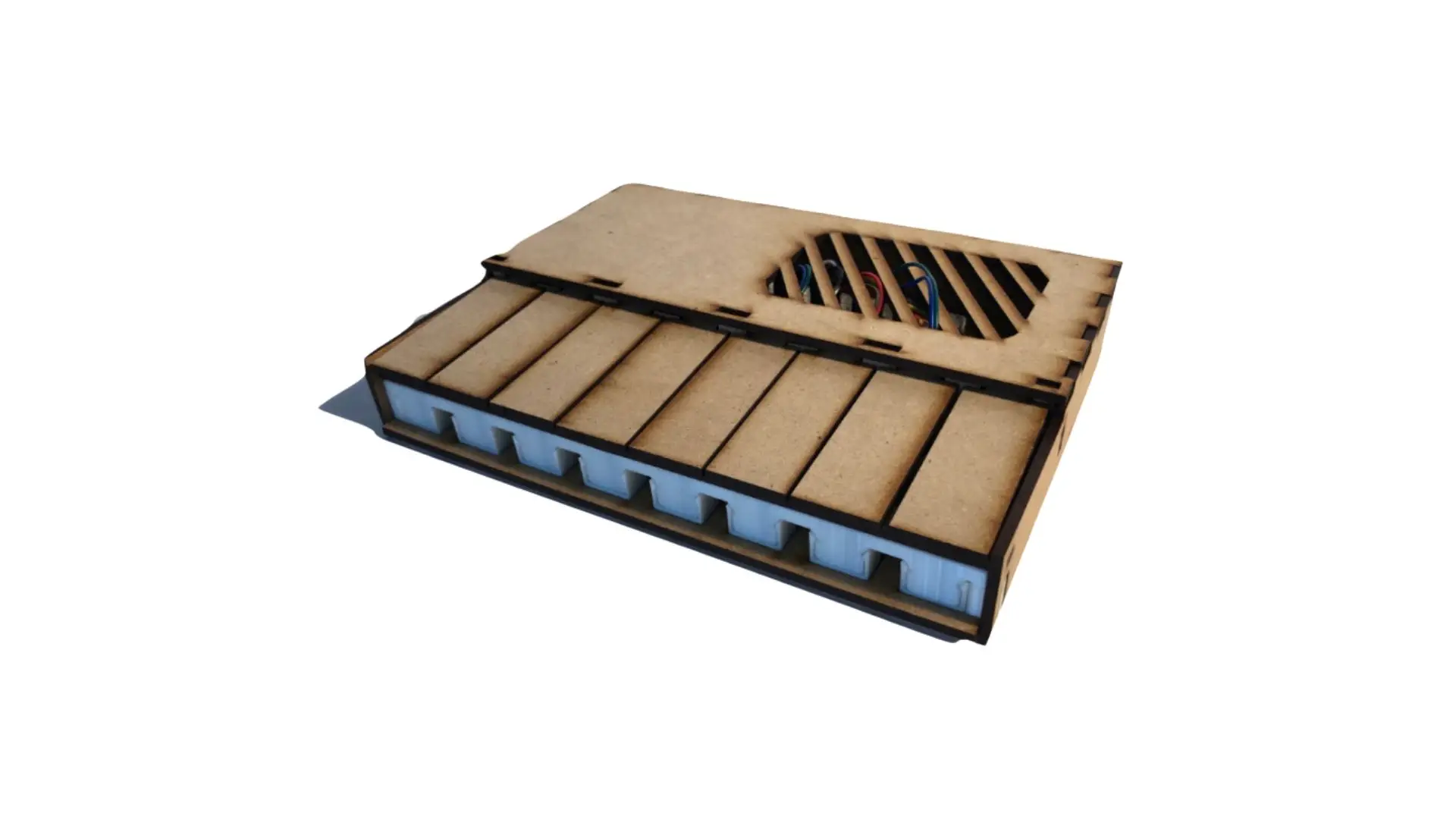
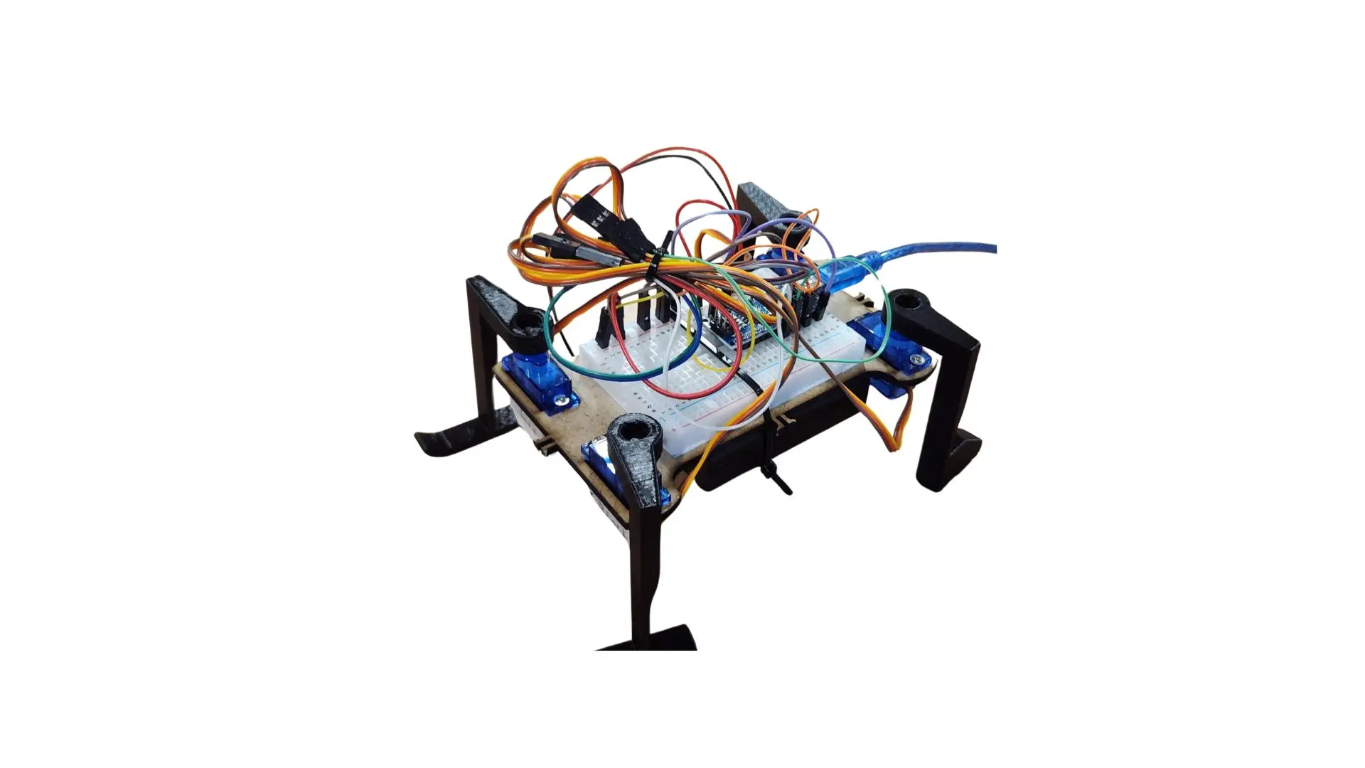
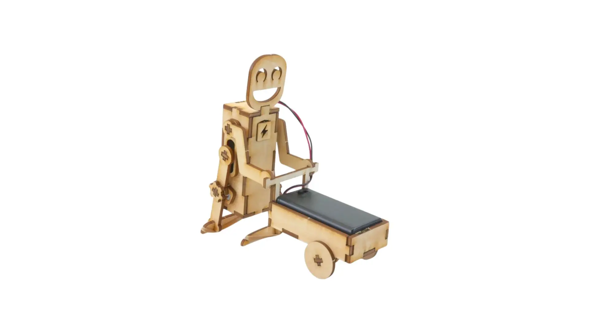
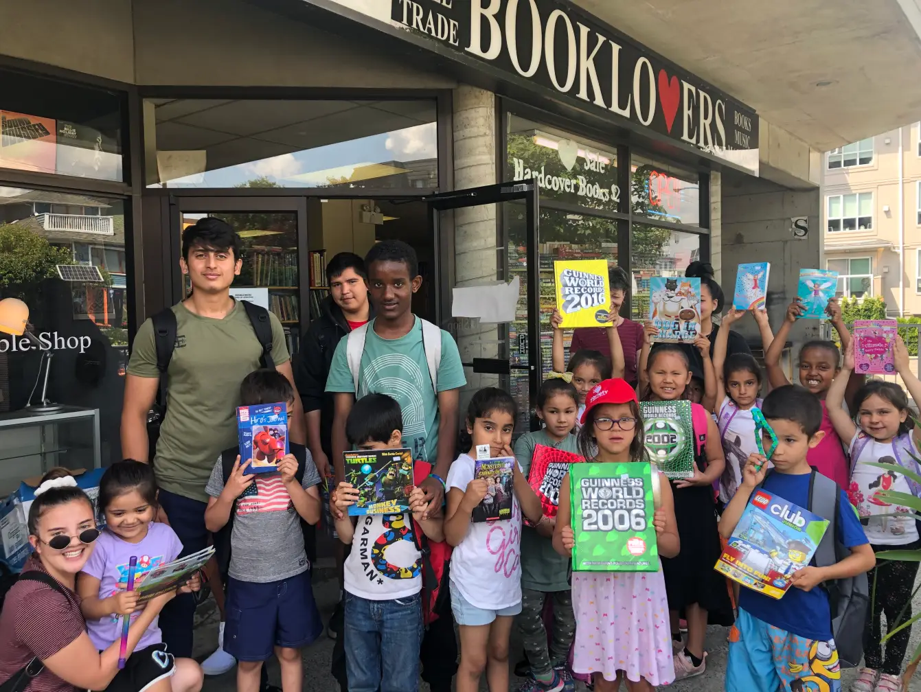
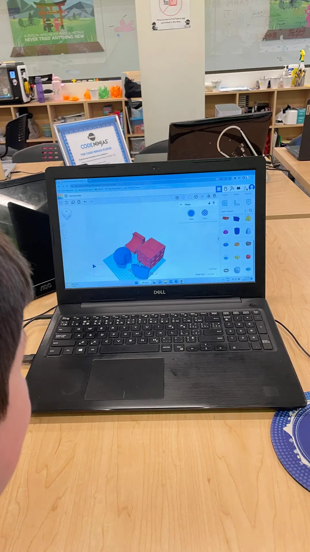
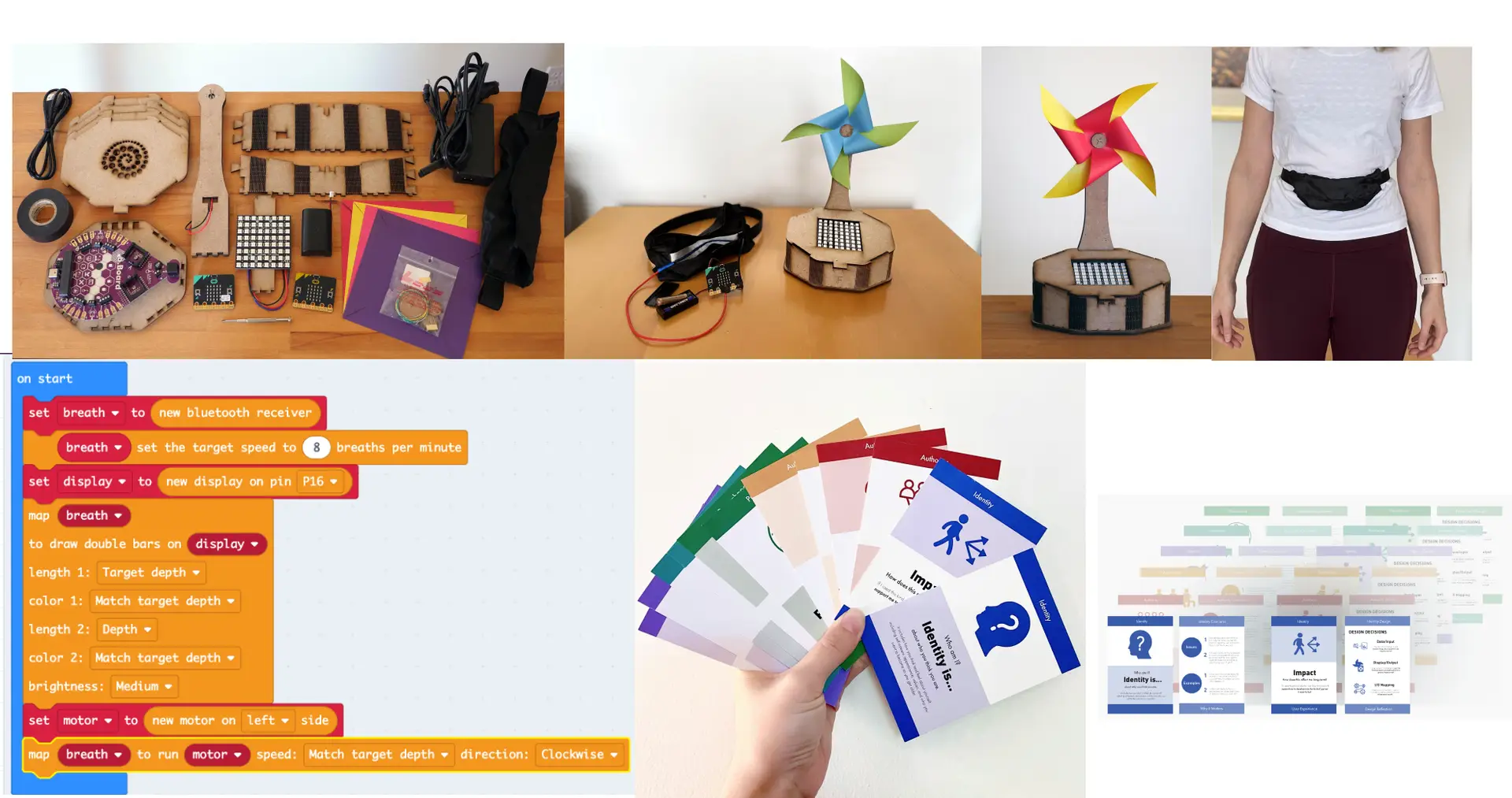
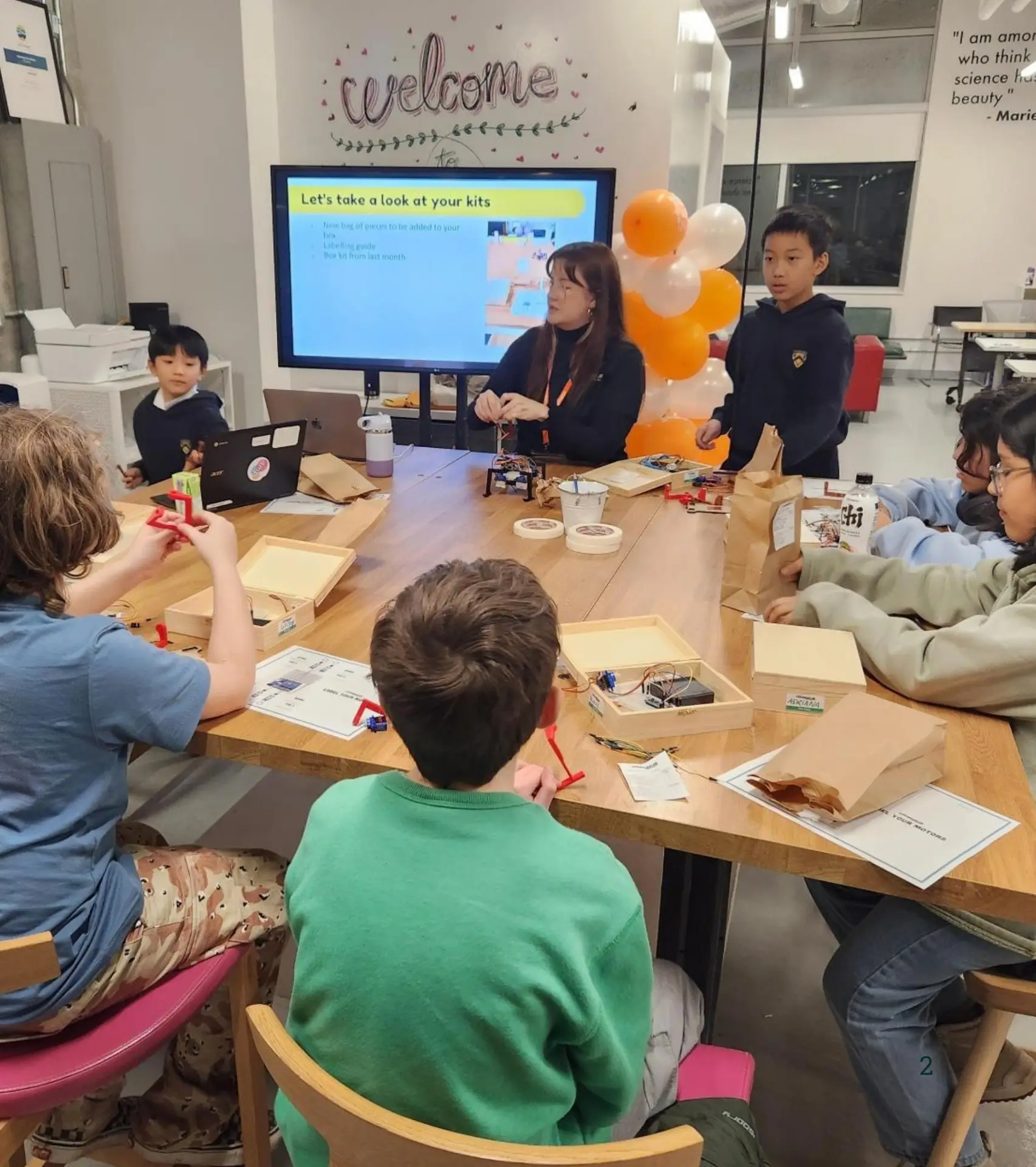
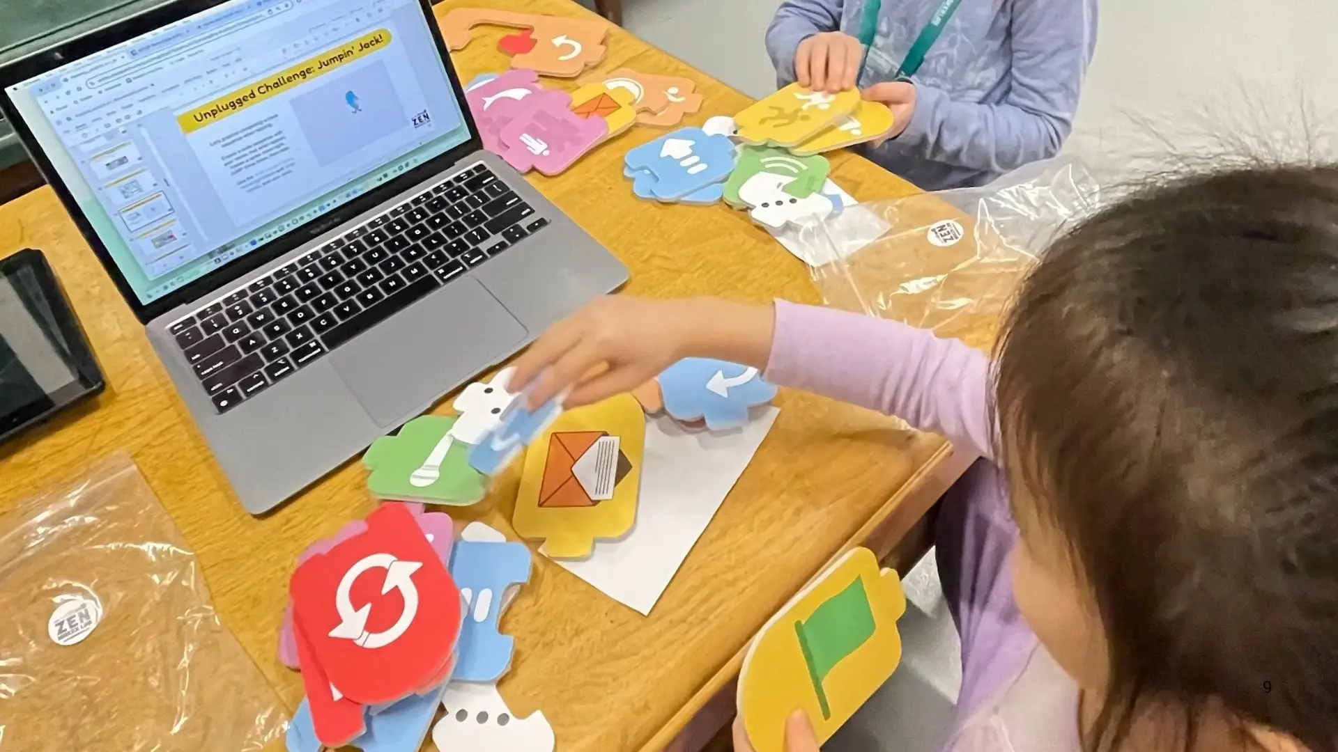
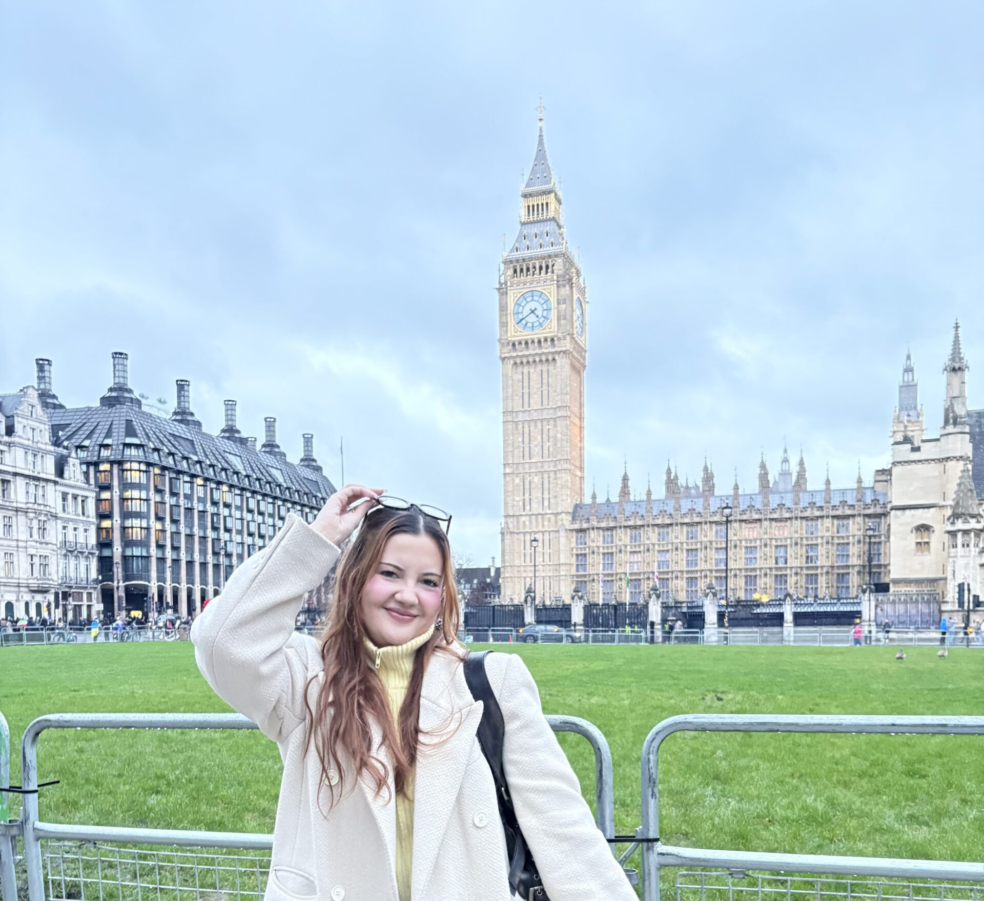
Photography from the site.
Real photos already in use — STEM curriculum kits from the Work page, and people and process photos from the About page.
Icon set.
Phosphor icons, Light weight. A sample below — 1512 icons in the full set.
 lightbulb-filament
 brain
brain
 robot
robot
 graduation-cap
 flask
flask
 game-controller
 lightning-a
 compass
 chat-centered-dots
 lock-key
 gear
gear
 heart
heart
 map-pin-area
 moon
moon
 music-notes
 paint-brush-broad
 house
house
 globe-hemisphere-east
Colour palette.
Every swatch below shows its real colour and hex code, read live from the site's own stylesheet.
Surface
Primary
Greys
CTA
Fonts and type sizes.
Two fonts, used across the whole site: Open Sans for everything, and Fontdiner Swanky for page titles and hero headlines only.
Spacing, corners, and shadows.
The spacing scale, corner-radius options, and shadow styles used across the site.
Spacing
Radius
Elevation
Hairline border, default rest
Hover lift on cards
Pill button bottom edge
Buttons.
Three styles: a filled pill for the main action on a page, an outline for a secondary action, and a plain text link for everything else.